Multi-Chart
Line-, Bar-, Scatter- and Area-Chart can be used together. Meaning you can visualize one series with a line and another one with bars in the same chart. This is why this widget type is also called multi-chart.
Creating a multi-chart
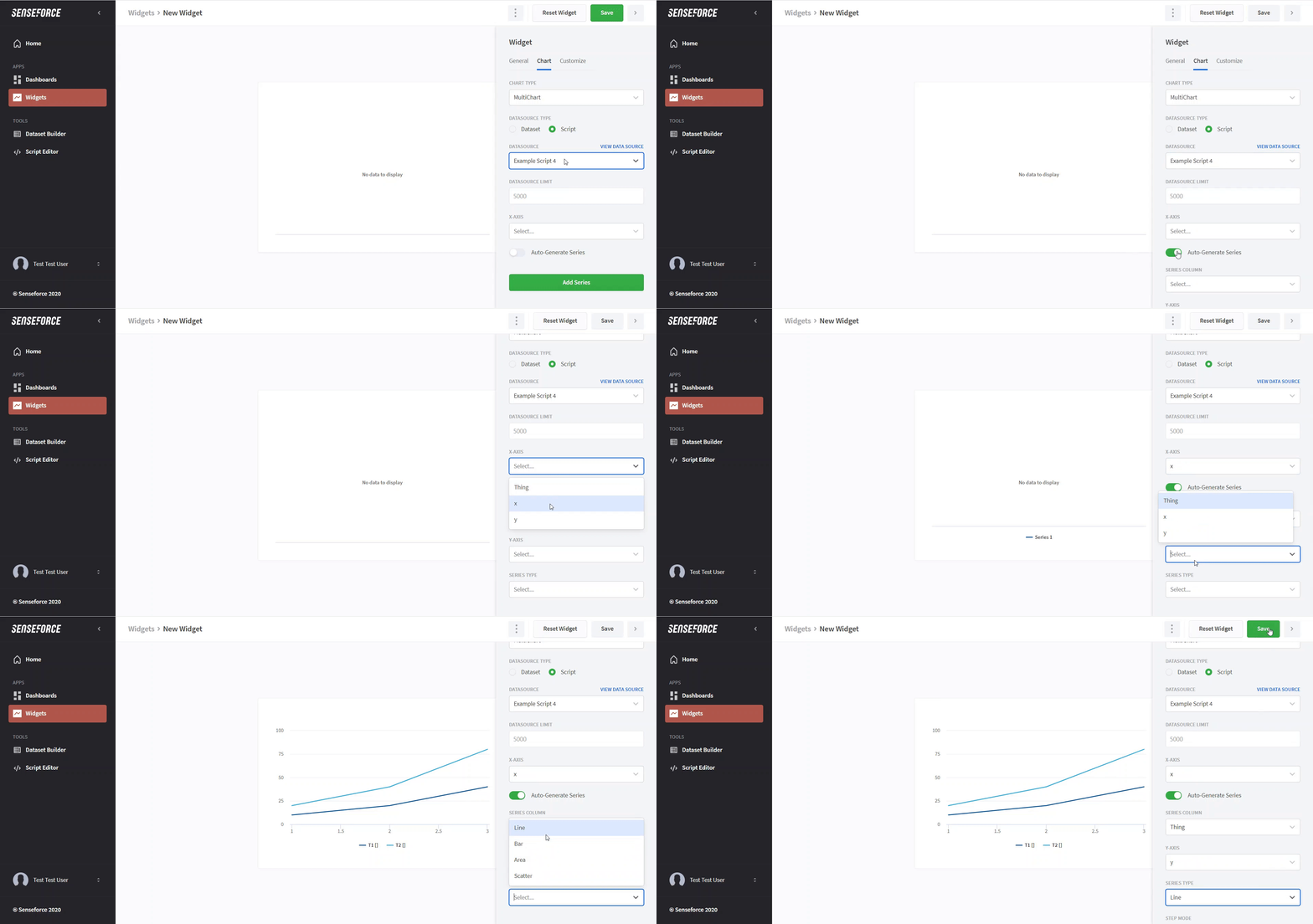
A simple example of how to build a multi-chart can be found here.
There are a few options you have in displaying your series (depending on the type of series you choose). For line and area series, you can select a stepping mode. Instead of connecting the data points with a straight line, the line will make a step at the given point. The option cumulative or delta is available for all types, where cumulative sums up the values of all previous (lower x value) points and delta displays the difference between consecutive points.
Set color or color conditions for data series
To customize the color in your line chart, uncollapse the color section. 1. If you want to set a specific color for a data series, click on "Fixed" and choose a color. 2. If you want to set a color, based on numeric conditions for a data series, choose "Conditional". There you can set a condition and choose a color for it. You can add multiple conditions for each data series. For that, just add another condition with the button "ADD CONDITION" beneath the settings. 3. You can decide to respect this color in the legend. After activating the setting, you can choose a name for the color in the legend.
Set additional tooltip values
By default, when you hover over a series, you will see the timestamp and the value of the data point closest to your mouse cursor.
In the section Additional tooltip values, however, you have the option to include additional information in the chart's tooltip.
To do so, follow these steps:
Open the Additional tooltip values section.
Click the Add tooltip value button.
Select a label and a column from your chart's dataset that you want to be displayed in the tooltip, alongside the default timestamp and value information.
This allows you to customize the tooltip to show specific data points relevant to your analysis.
You can add a maximum of three additional tooltip values.
Adding additional tooltip values will disable certain optimization features utilized by charts without additional tooltips values.
Please be aware that when working with charts containing extensive data and additional tooltip values, it could potentially result in performance issues on your device.
Auto-Generated Series
If you have a variable or big amount of series (e.g. one series for every machine) you do not necessarily need to create separate series in your widget. You can use "auto-generated series". Consider the following data:
Thing | x | y |
T1 | 1 | 10 |
T2 | 1 | 20 |
T1 | 2 | 20 |
T2 | 2 | 40 |
T1 | 3 | 40 |
T2 | 3 | 80 |
As you can see for every distinct value in the column selected as a series column a new series is generated. Make sure to select a series type beforehand saving will be disabled.
Alphabetical sorting
If you are using the Auto-Generated Series option then all series are sorted by the order of the data which is displayed in this chart. This means if data for 'Series B' comes first in the input data, then some data of 'Series C' and then 'Series A', the order in the legend will be the same (Series B, Series C, Series A).
If this is not desired you also have the option to alphabetically sort the order of the series in the chart legend. If the same series names appear in multiple widgets on a dashboard, alphabetically sorting also ensures that they have the same colour over the entire dashboard.
Alphabetically sorting the series names does not change the sorting of the input data. This means if you are using strings on the x-axis, the order of the appearance of each unique entry in the data is the same as the order used for displaying the data.
Customization
In the following, we will describe some of the options of customization which are not self-explanatory.
Chart
Stacking Mode
The following picture explains the three options.
If you only have one series with multiple values on one point of the x-axis select stacking mode "Normal" if you use a bar chart. The other stacking modes will display the bars behind each other, which might hide some values.
Zoom Mode
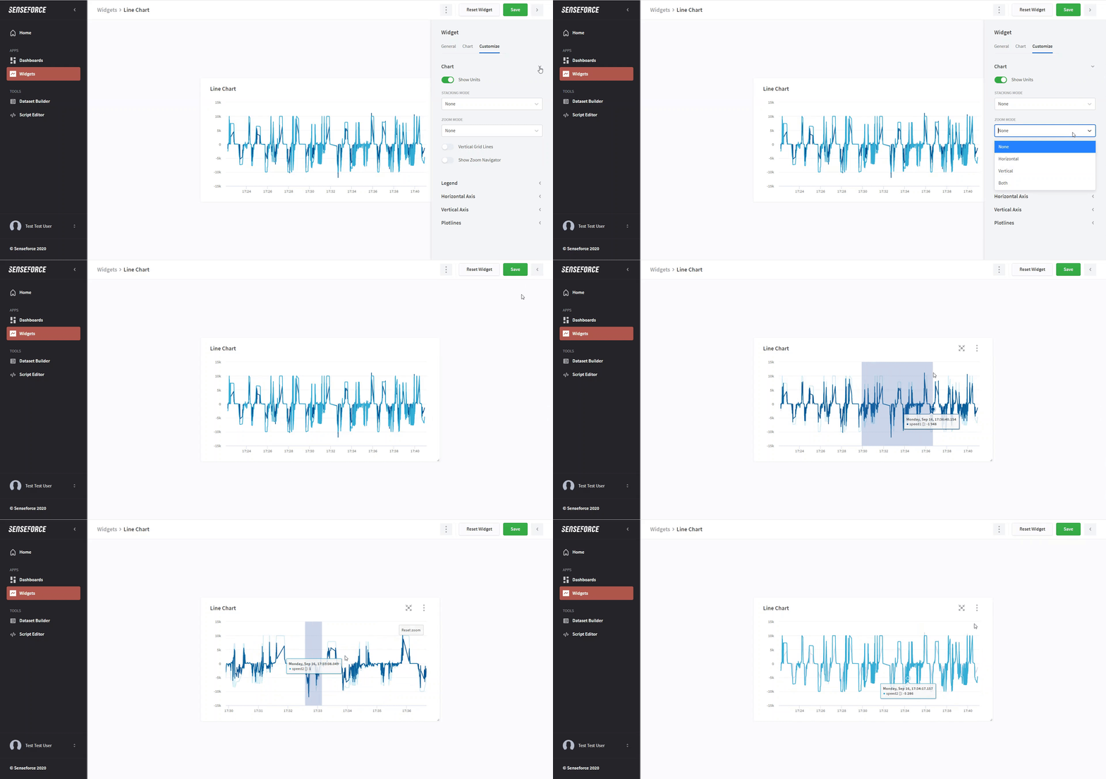
The zoom mode is used by clicking and dragging a window on the widget. This has the advantage that you do not accidentally zoom into a widget when scrolling down on a dashboard.
Axis
Ordinal (Horizontal Axis)
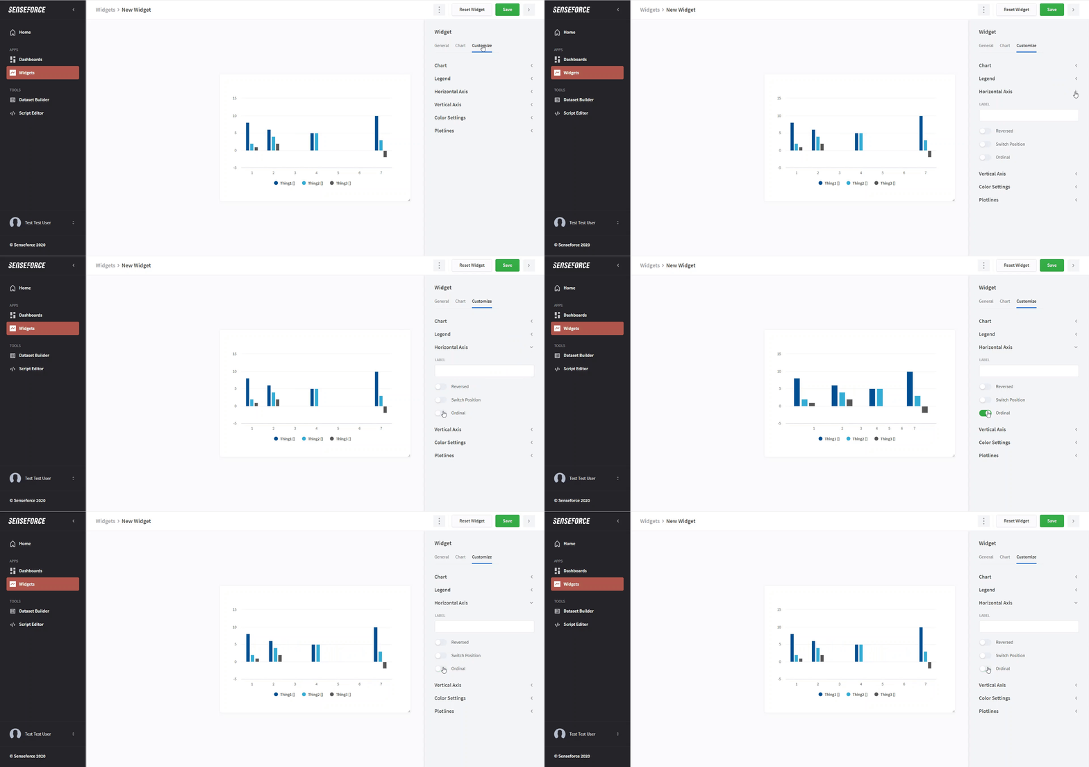
X values are automatically arranged by their value and according to the distance (or time) between them. If you activate ordinal the distance between them is ignored. Instead, the data points are arranged on an equidistant grid.
.
Plotlines
With the plotlines feature you can add additional vertical or horizontal lines to your multi-chart using a different data source than the one you used for the series in the chart. This can be used for example to combine live data and aggregated data, where the live data comes from one dataset and e.g. the minimum, maximum values, benchmark, or threshold come from a different dataset.
Dashboard filters are applied to the data source used for the plotlines in the same way they are applied to the main data source.
Labels
With the labels feature, you can set triggers for critical values that display a label in the graph with the name of the data series. In order to do this, your multi-chart should have auto-generated series or custom ones. You can set up different conditions for a trigger.
Compare series column values with another datasource column value All the values from the series column will be compared considering the selected operator against the first value of the datasource column value
Compare series column values with another fixed value All the values from the series column will be compared considering the selected operator against the fixed value defined
When the trigger condition meets, a label will be displayed with the name of the data series column.


